The Psychology of Colour: How Colour Choices Affect Energy & Well-Being in Your Home
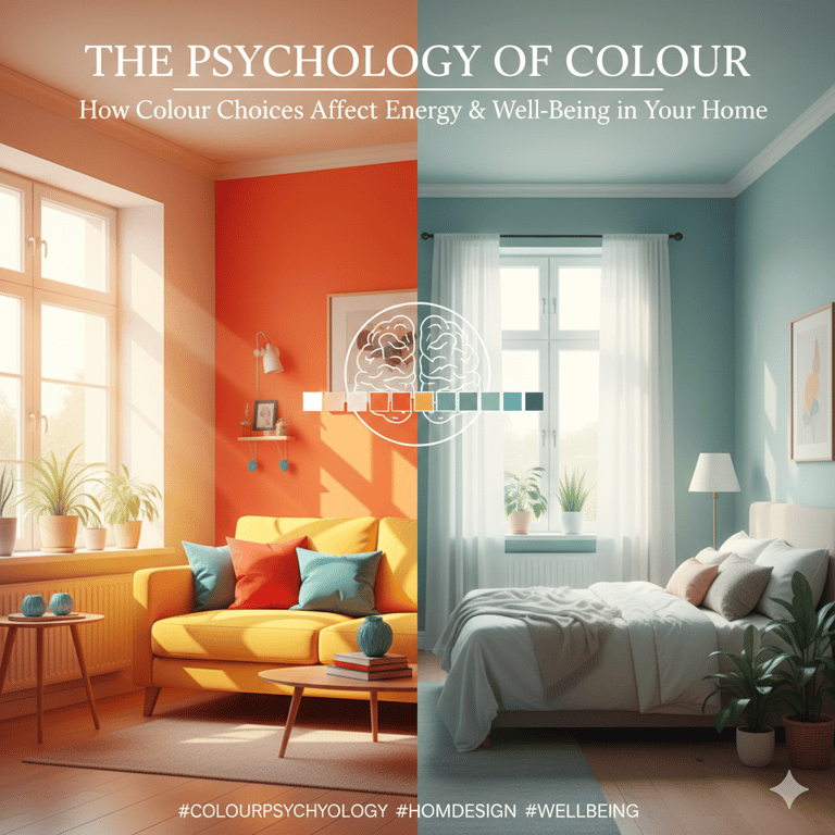
Colour is far more than a design choice—it’s a psychological tool that directly influences mood, energy levels, and overall well-being. In your home, the colours you surround yourself with can calm your mind, boost productivity, improve sleep, or even increase social connection.
1/19/20262 min read
Why Colour Psychology Matters in Home Design
Every colour triggers emotional and physical responses in the brain. These reactions are shaped by biology, culture, and personal experience. In residential spaces, the wrong colour can create stress or fatigue, while the right one can promote balance, comfort, and positivity.
Thoughtful colour selection can:
Reduce anxiety and mental fatigue
Improve focus and creativity
Enhance sleep quality
Create emotional harmony between rooms
How Different Colours Affect Mood & Energy
Blue – Calm, Clarity & Relaxation
Blue is known for its calming effect on the nervous system. It lowers heart rate and promotes relaxation.
Best for:
Bedrooms, bathrooms, meditation spaces
Avoid:
Overuse in social areas—it may feel too quiet or cold
Green – Balance, Renewal & Well-Being
Green represents nature, harmony, and health. It’s one of the most psychologically restful colours.
Best for:
Living rooms, home offices, reading areas
Why it works:
Reduces stress and promotes emotional balance
Yellow – Optimism, Energy & Warmth
Yellow stimulates happiness and mental clarity. It encourages communication and optimism.
Best for:
Kitchens, dining areas, entryways
Use carefully:
Too much bright yellow can cause restlessness or anxiety
Red – Energy, Passion & Stimulation
Red increases heart rate and energy levels. It’s bold, powerful, and emotionally intense.
Best for:
Dining rooms, accent walls
Not ideal for:
Bedrooms or small spaces—it can feel overwhelming
Orange – Creativity & Social Connection
Orange combines the energy of red with the cheerfulness of yellow.
Best for:
Creative studios, playrooms, casual living areas
Effect:
Encourages enthusiasm and conversation
Purple – Luxury, Intuition & Calm
Lighter purples promote calm, while deeper shades feel luxurious and dramatic.
Best for:
Bedrooms, dressing areas
Tip:
Soft lavender tones are more relaxing than dark purples
Neutral Tones – Stability & Comfort
Beige, taupe, grey, and warm whites provide grounding and flexibility.
Best for:
Whole-home palettes, minimalist interiors
Tip:
Pair with textures and accents to avoid flatness
Colour Temperature & Emotional Impact
Warm colours (reds, oranges, yellows): energizing, cozy, stimulating
Cool colours (blues, greens): calming, spacious, relaxing
Balancing warm and cool tones across your home prevents emotional extremes.
Using Colour Strategically in Each Room
Bedroom: Soft blues, greens, muted neutrals for restful sleep
Living Room: Balanced neutrals with warm accents for connection
Kitchen: Light yellows, warm whites, soft greens for freshness
Home Office: Greens or blues for focus and reduced eye strain
Bathroom: Cool tones for cleanliness and calm
The Role of Natural Light
Natural light changes how colours are perceived. A colour that looks warm in daylight may feel dull at night. Always test paint shades at different times of day before finalizing.
Final Thoughts
Your home should support your mental and emotional well-being—not drain it. By understanding the psychology of colour, you can create spaces that restore energy, improve mood, and enhance daily life. Choosing the right colours isn’t just about trends—it’s about how you want to feel in your own space.
Follow Us
Crafting interiors that reflect your unique lifestyle.
Contact
+971-5446-17571
©2026 Ivory&Stone Studio- All rights reserved